More than 80 percent of alumni claim to read at least some of every Potash Hill, but a resounding 100 percent have well-formed opinions about the magazine’s design and content. That was one of the many important outcomes resulting from a multi-stage constituent outreach effort last spring, which led up to the new design and organization of the present issue. Some of the results were surprising, most of them were encouraging, but all of them reinforced the importance of community exploration and the high value placed on Potash Hill by its readership.
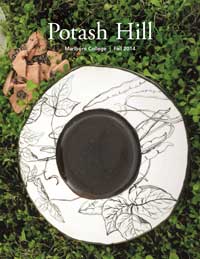
The impetus to redesign Potash Hill came about because the publication had remained virtually unchanged for more than 20 years. There was an interest in eliminating the segregation of features by areas of study, which our faculty deemed outdated and out of step with their own interdisciplinary interests. Many were interested in introducing more color images and typography, made possible by the diminishing price differential for color printing. With the recent work on Marlboro’s marketing materials and website, it seemed like the opportune time to explore changes to the college’s flagship publication.
The outreach effort started with a series of three focus groups in March and April 2014, involving small groups of students, faculty, and alumni, respectively, to get a pulse on their opinions of Potash Hill. In each case, participants were asked to reflect on the magazine’s current (now former) format, and consider what other content or design elements they would like to find there.
The focus groups could not be considered representative of all Marlboro constituents, due to the small number of participants (a total of 11), but many of their suggestions provided valuable guidance and direction. For example, all of the groups appreciated the simplicity of Potash Hill, the beautiful photography and artwork, and the quality of the articles. All agreed that they’d like to see more coverage of what faculty are up to, more alumni notes, and more short, digestible articles.
Opinions were diverse (this is Marlboro, after all) regarding whether the magazine should introduce more color photographs and artwork. Some felt that the black and white was simpler, more calming, and consistent with Marlboro’s frugal nature, while others were clear that color could be more inviting, exciting, and consistent with Marlboro’s vibrant culture. Faced with the fact that the additional cost of color printing is negligible, most participants agreed that adding color could be a good thing, if strict attention is paid to preserving the simplicity of the magazine and not distracting from the content.
Concurrent with the focus groups was an online survey sent to alumni and other supporters of the college. We received 114 responses to the survey, including those from graduates ranging from the 1950s to the most recent decade as well as 25 non-alumni. Respondents reported that their favorite kinds of stories in Potash Hill are “news from alumni” (92 responses). This was followed by “articles by alumni reflecting on their continued work” (85 responses), “news on new faculty and retiring faculty” (85 responses), and “articles on the history of Marlboro College” (84 responses).
Several respondents took the opportunity to point out that the design and content of Potash Hill is superior to alumni publications they receive from other institutions. One respondent said, “Its design reflects the intellectual curiosity, artistic sensibility, earthiness, and intimacy that all comprise the Marlboro experience.” As we moved forward with new design and content ideas, we have felt a clear mandate to preserve all of these attributes. We welcome your comments on how well we have succeeded.